Motherhood Fertility & IVF
ROLE: Art Director & Design Lead
AGENCY: Pichkaari Design Studio
DISCIPLINE: Brand Strategy, Art Direction, Campaign Concepts
Concept and art direction developed at Pichkaari Design Studio for the Motherhood Fertility & IVF pitch. The work shown here represents the unselected pitch concept; the final live brand followed a different direction.
Motherhood came to the pitch with a specific problem: in a category where every fertility brand was using the same pink, the same gentle voice, and the same promise of "we care about you," how do you stand out without losing the warmth the category requires? The fertility and IVF market in India is growing fast, but the brand language hasn't caught up. Patients are navigating a confusing, expensive, emotionally heavy decision, and the brands meant to guide them all sound the same.
Rather than a single brand promise, the work proposed three distinct roles Motherhood could occupy, each addressing a different patient pain point and each with its own voice register. Together they made the brand legible across the entire patient journey, from the first confused Google search to the cultural conversation around IVF, without any one execution having to do everything.
Three roles. Three voices. One brand.
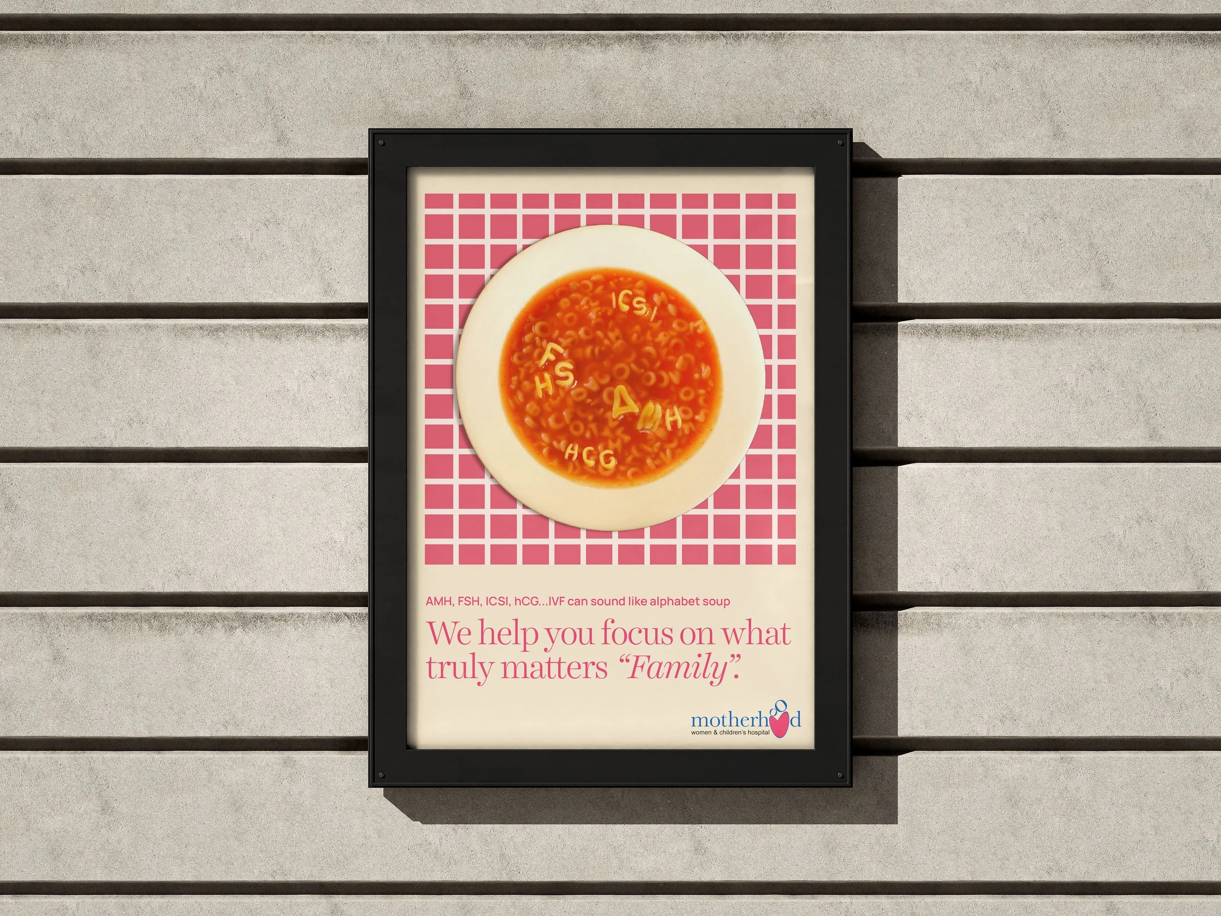
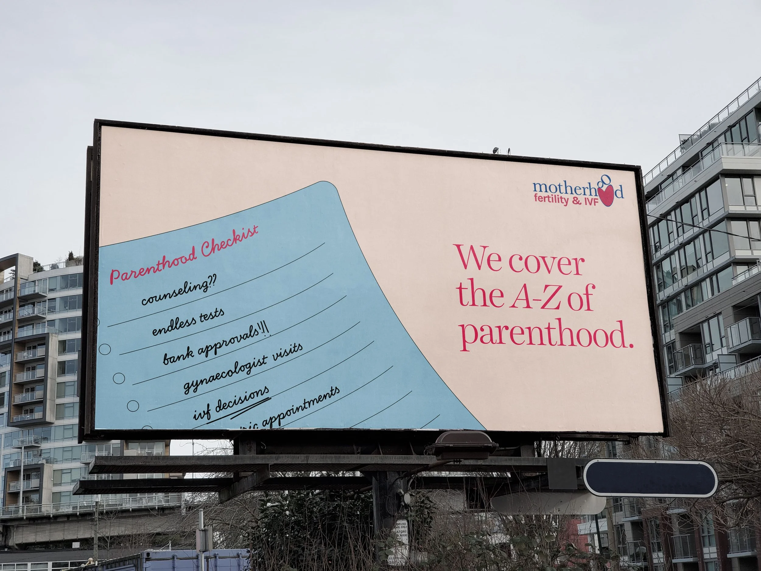
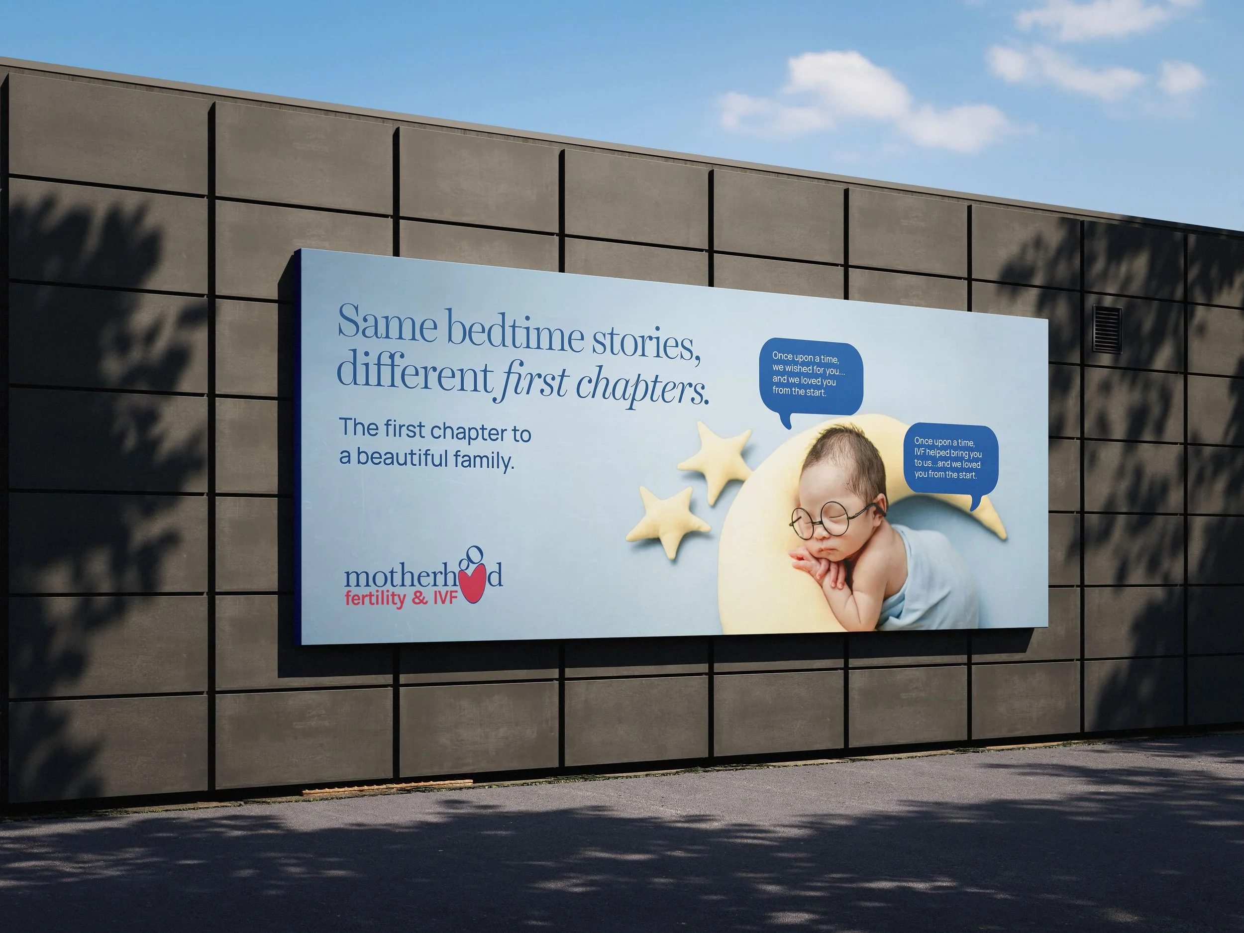
01. The Clarity Champion
Patients arrive at fertility care drowning in acronyms — IUI, ICSI, FET, AMH, hCG. The medical language is a barrier disguised as expertise. Motherhood's first role was to translate, not to dumb down. The voice here is straightforward, reassuring, educational. The work makes the jargon visible so it can be set aside.
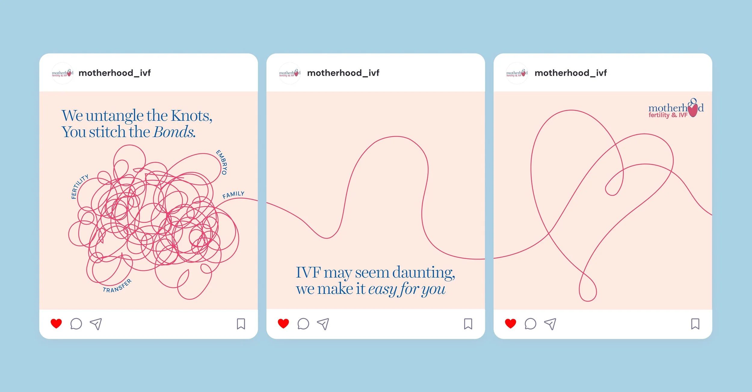
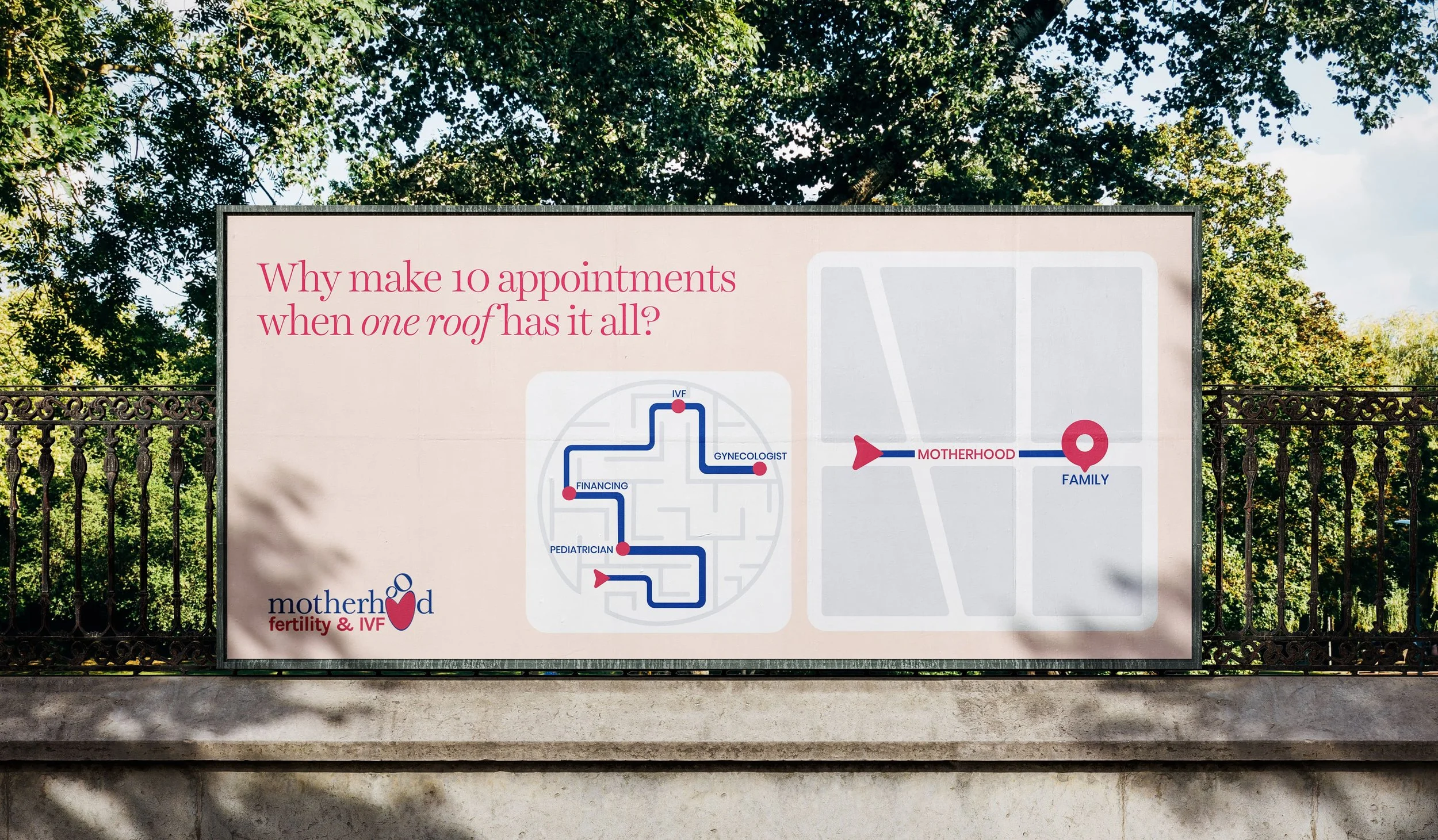
02. The Complete Journey Partner
The fertility journey doesn't end at conception. It runs from first consultation through gynaecology, IVF, financing, pediatrics — and most patients are forced to reassemble the team themselves at every stage. Motherhood's hospital network covers all of it under one roof. The voice here is more practical. The work names the friction it removes.
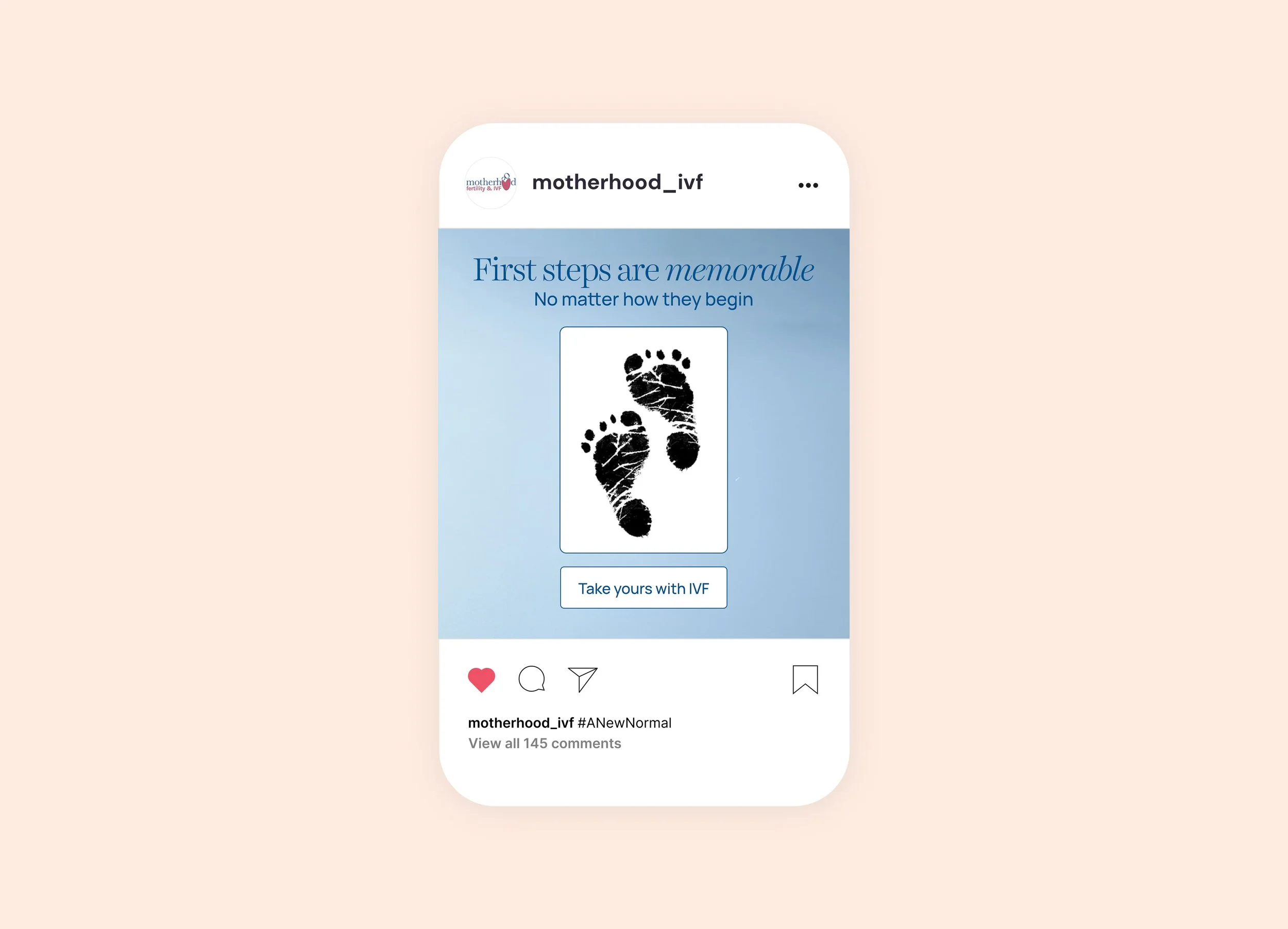
03. The Stigma Challenger
Forty percent of Indians still believe infertility is a woman's issue. Less than one percent of couples experiencing sub-fertility seek medical help. The category-level problem isn't awareness, it's shame. Motherhood's third role was to take that on directly, without preaching. The voice here is bolder. Empathetic but not soft.
The thinking behind the system
The three roles weren't a brand book exercise. They were a way of solving a category problem with category tools, a fertility brand can't outshout its competitors, but it can carry a richer set of meanings across more moments of the patient journey than any single-promise competitor can.
Each role has its own voice register, its own visual language, and its own audience. The Clarity Champion speaks to the confused first-time researcher. The Complete Journey Partner speaks to the patient mid-treatment, exhausted by logistics. The Stigma Challenger speaks to the cultural conversation outside the consultation room.
The brand stays recognisable across all three because the underlying craft, the typography, the use of cream and blue, the restraint — holds.
The work was developed for a pitch. The final brand went a different way. The strategic frame — three roles, one brand, is the part that travels.
All work shown developed at Pichkaari Design Studio. Concepts remain the intellectual property of Pichkaari per agency engagement terms. Published with permission.